.png)


Email CTA best practices: boost e-commerce conversions

TL;DR:
- Small CTA changes can boost click-through rates by up to 127 through systematic testing.
- Clarity, relevance, and urgency are essential qualities of effective email CTAs.
- Personalization and segmentation significantly improve CTA performance, increasing relevance and response rates.
Small changes to your email CTAs can feel trivial until you see the data. Brands that systematically A/B test their CTAs report click-through rate lifts of up to 127%, which means doubling your engagement from a single button tweak is not a fantasy. Yet most e-commerce marketing managers spend hours on email design and subject lines while treating the CTA as an afterthought. That is the gap this guide closes. You will find actionable, proven strategies for writing, designing, testing, and personalizing CTAs that genuinely move customers from inbox to checkout.
Table of Contents
- What makes an effective email CTA?
- A/B testing CTAs: Unlocking higher engagement rates
- Personalization and segmentation: The hidden power of tailored CTAs
- Design and placement: Making CTAs stand out for conversions
- Why most email CTA advice misses the mark
- Boost your results with proven retention strategies
- Frequently asked questions
Key Takeaways
| Point | Details |
|---|---|
| A/B testing boosts CTR | Testing CTA variants can increase email click-through rates by up to 127%. |
| Personalization drives results | Segmented and personalized CTAs generate 42% higher conversion on average. |
| Design and placement matter | Well-placed, visually appealing CTAs capture more clicks and drive action. |
| Iterate for success | Continuous refinement of CTAs leads to sustained improvements in engagement. |
What makes an effective email CTA?
A call-to-action (CTA) in email marketing is the specific element, usually a button or linked text, that tells a reader exactly what to do next. It is the bridge between a compelling email and a completed purchase, signup, or download. Without a clear CTA, even the most beautifully written email leaves revenue on the table.
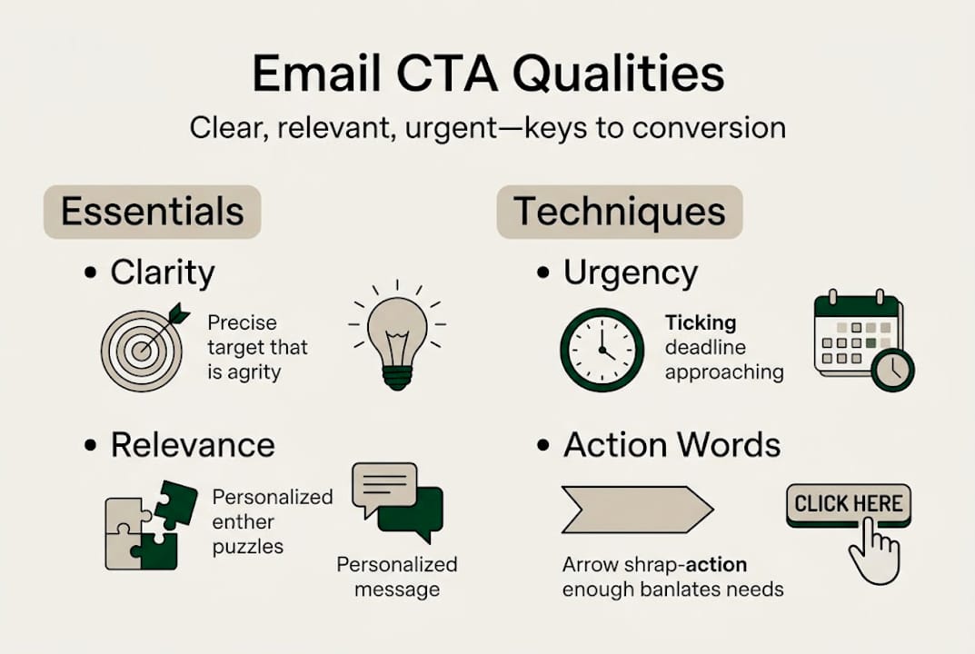
Effective CTAs share three non-negotiable qualities: clarity, relevance, and urgency. Clarity means the reader knows instantly what will happen when they click. “Shop the sale” beats “click here” every time because it removes ambiguity. Relevance means the CTA matches where the reader is in their journey. A first-time subscriber gets a different offer than a loyal repeat buyer. Urgency creates a reason to act now rather than later. Phrases like “offer ends tonight” or “only 3 left” tap into real purchase psychology without feeling manipulative when they are true.
Personalization is where many marketers leave serious performance on the table. Personalized CTAs can perform 42% better than generic ones, and this is not surprising when you think about it. A CTA that speaks directly to a customer’s recent browsing history, purchase behavior, or stated preferences feels less like advertising and more like a helpful suggestion. Understanding what are email CTAs at a strategic level, not just as buttons, is the first step toward using them with that kind of precision.
Here are the most common CTA pitfalls DTC brands fall into:
- Using vague language: “Learn more” and “click here” offer no incentive or direction
- Overcrowding with multiple CTAs: more than two competing options dilutes focus and lowers clicks
- Ignoring mobile sizing: buttons under 44px tall are difficult to tap and cost you mobile conversions
- Blending into the background: low-contrast buttons go unnoticed regardless of copy quality
- No urgency or benefit: the CTA should communicate value, not just action
“The CTA is not just a button. It is the moment of decision for your customer. Everything in your email should build toward it.”
Pro Tip: Write your CTA before writing the rest of your email. Knowing the exact action you want readers to take keeps every sentence in the email focused on leading them there.
A/B testing CTAs: Unlocking higher engagement rates
Knowing what makes a CTA effective is one thing. Knowing which version of that CTA your specific audience responds to is another. That is the job of A/B testing. It removes guesswork and replaces it with data from your actual customers, not industry averages.
The numbers are hard to ignore. Consistently testing button text, color, placement, and wording can increase CTR by 127%, making it one of the highest-leverage activities in email optimization. If you are not running regular CTA tests, you are flying blind while your competitors are navigating with GPS.
Before you start, understand the email A/B testing basics so you test one variable at a time, collect statistically significant data, and reach conclusions you can actually act on. Running tests without a clear hypothesis is just noise.
Here is a simple process to follow:
- Choose one variable: button text, color, placement, or size, never more than one at a time
- Split your list evenly: randomize the split to eliminate segment bias
- Set a success metric: click-through rate is usually the right one for CTAs
- Run the test long enough: aim for at least 1,000 sends per variant and 7 days of data
- Document and apply: update your CTA standards based on what wins, then test the next variable
| CTA element | What to test | Typical CTR impact |
|---|---|---|
| Button text | “Shop now” vs. “Get my deal” | High |
| Button color | Brand color vs. contrast color | Medium to high |
| Placement | Above the fold vs. below content | Medium |
| CTA shape | Rounded vs. square corners | Low to medium |
| Copy urgency | Generic vs. time-limited language | High |
Understanding how A/B testing and revenue connect at the campaign level helps you prioritize where to test first. Focus on the elements with the highest impact potential, like copy and placement, before fine-tuning design details.
Personalization and segmentation: The hidden power of tailored CTAs
Generic CTAs treat every subscriber the same. That is a missed opportunity. Your customer list contains first-time visitors, loyal repeat buyers, lapsed customers, and seasonal shoppers, each with different motivations and readiness to buy. A single CTA cannot serve all of them equally well.
Segmentation lets you match CTA language and offers to specific audience groups, which directly increases relevance and response. Personalized CTAs deliver 42% better performance than their generic counterparts, and this advantage compounds when you layer behavioral data into your personalization strategy.
Here is how DTC brands are using personalized CTAs effectively:
- Loyalty tiers: “Unlock your VIP reward” for top-tier customers vs. “Join our rewards program” for new subscribers
- Browse abandonment: “Pick up where you left off” with a product-specific image and CTA
- Replenishment flows: “Time to restock your [product name]” using purchase frequency data
- Win-back campaigns: “We miss you, here is 20% off” targeted at customers with 90 plus days of inactivity
- New arrivals for category buyers: “New in [category they love]” rather than a generic new arrivals blast
Pro Tip: Start segmenting CTAs using just two groups: customers who have purchased before and those who have not. Even this simple split will reveal meaningful differences in what messaging drives action.
For a deeper framework, explore personalizing email content for e-commerce and use a personalized email strategy guide to build out your segmentation logic.
| Segment | CTA approach | Expected lift |
|---|---|---|
| First-time visitors | Benefit-led, low commitment | Moderate |
| Repeat buyers | Loyalty-focused, exclusive offers | High |
| Lapsed customers | Re-engagement, urgency-driven | Variable |
| High-value customers | VIP language, early access | High |
| Category browsers | Product-specific, relevant imagery | Moderate to high |
Design and placement: Making CTAs stand out for conversions
Your CTA copy can be perfect, but if it is hidden in a wall of text or matches your email background, nobody clicks it. Design and placement are not aesthetic decisions. They are conversion decisions.
Visual hierarchy in email means guiding the reader’s eye toward the CTA. Everything above the button, including the headline, hero image, and body copy, should point toward one clear action. When readers arrive at your CTA, clicking should feel like the obvious next step.
The email design best practices that consistently lift CTA performance include:
- High contrast button color: your CTA button should stand out from the background, not blend with the brand palette
- Minimum 44px button height for mobile: finger-friendly tap targets reduce friction on phones
- White space around the button: avoid crowding the CTA with competing elements
- Single-column layouts on mobile: ensures the CTA is always full-width and visible
- First CTA above the fold: readers should not have to scroll to find the primary action
Systematically testing button text, color, and placement is what separates guessing from knowing. Small design tweaks accumulate into significant CTR gains over time.
Pro Tip: Use a contrasting CTA color that appears nowhere else in the email. When one color is reserved solely for the button, readers instinctively learn what to click.
For DTC brands, the biggest design mistake is using CTAs that look like links rather than buttons. Buttons signal importance and affordance. Linked text feels optional. Apply email marketing design best practices that are built specifically for e-commerce, where visual product presentation and purchase intent need to work together seamlessly.
Why most email CTA advice misses the mark
Here is the uncomfortable truth about most CTA guides: they hand you a list of best practices as if your audience is the same as everyone else’s. Use red buttons. Add urgency. Keep it short. These tips are not wrong, but they are incomplete in a way that can actually hurt you.
We have seen brands copy industry “winning” CTA formulas and watch their metrics drop because the formula did not fit their customer’s voice or journey stage. Best practices are starting points, not finish lines. The brands that consistently outperform their benchmarks are the ones building iterative testing systems, not borrowing other people’s conclusions.
Personalization is not a feature you add on top of your CTA strategy. It is the foundation. Reviewing an e-commerce CTA case study from a brand in your category is worth more than ten generic guides because you see exactly what worked in a real context.
The real work is showing up, testing, documenting, and adapting. Consistent iteration beats any single “best practice” every time.
Boost your results with proven retention strategies
If the strategies in this article resonate, the next move is to see them applied in real e-commerce campaigns. At The Email Marketers, we build CTA strategies that are rooted in data, tested against your actual audience, and designed to grow lifetime value, not just one-off clicks. Browse our CTA success stories to see how DTC brands have used targeted CTA optimization to drive measurable revenue. Then explore the Retention Lab resources for frameworks, tools, and playbooks you can apply immediately. Whether you are starting from scratch or refining an existing program, we have the expertise to help you build CTAs that convert.
Frequently asked questions
What is the most important factor for a high-converting email CTA?
Clear, actionable language combined with prominent placement are the two factors that most reliably drive conversions. Button text, color, and placement all influence CTR, but copy clarity is where most brands have the fastest wins.
How often should I A/B test my email CTAs?
Test monthly or quarterly to continuously improve click-through rates and stay responsive to shifting customer preferences. Regular CTA testing compounds over time, with each iteration building on the last.
Does personalization really impact CTA performance?
Yes. Personalized CTAs consistently outperform generic ones by up to 42%, making audience segmentation one of the highest-return investments in email optimization.
Is button color or copy more important for CTA effectiveness?
Copy clarity and urgency typically drive more impact than color alone. That said, testing button text and color together as separate experiments gives you the clearest picture of what is actually moving the needle for your audience.


