.png)


Email design best practices to boost engagement in 2026

Many e-commerce marketers believe beautiful emails equal successful campaigns. They invest heavily in stunning visuals, intricate layouts, and elaborate graphics, assuming aesthetic appeal drives results. However, revenue-focused email design proves this assumption wrong. The truth is that effective email design prioritizes deliverability, skimmability, and strategic element placement over pure beauty. This guide reveals evidence-based best practices that help e-commerce marketers optimize email design for genuine engagement and customer retention, moving beyond superficial aesthetics to drive measurable business outcomes.
Table of Contents
- Key takeaways
- Why designing for deliverability is the critical first step
- Optimizing email design for revenue: Beyond aesthetics
- Key email design elements every e-commerce marketer should prioritize
- Testing and iterating your email designs for continuous improvement
- Enhance your email marketing results with expert support
- FAQ
Key Takeaways
| Point | Details |
|---|---|
| Deliverability first | Your email design determines inbox placement, and simple single column layouts with readable text improve deliverability. |
| Centered CTAs boost revenue | Centered call to action buttons in the visual flow generate more clicks than CTAs placed in corners. |
| Skimmability drives conversions | Skimmable layouts with bold subheads and short paragraphs help readers quickly grasp value and act. |
| Single column layouts mimic emails | Single column layouts load faster and feel more like personal emails, boosting engagement and inbox placement. |
| Test design elements regularly | Regular testing of CTAs, layout, and image to text balance reveals what actually moves revenue beyond aesthetics. |
Why designing for deliverability is the critical first step
Your email’s visual design determines whether it reaches the inbox at all. Spam filters and inbox algorithms analyze layout patterns, image-to-text ratios, and structural elements before subscribers ever see your message. Conversational single-column designs mimic personal emails, signaling to filtering systems that your message deserves inbox placement rather than the promotions tab or spam folder.
Complex layouts with multiple columns, heavy graphics, or unusual formatting trigger algorithmic suspicion. These visual red flags suggest promotional content that belongs outside the primary inbox. When your beautifully designed email lands in the promotions tab, open rates plummet regardless of how stunning the creative looks. The harsh reality is that elaborate designs often work against you in the deliverability battle.
Single-column layouts build visual trust with both algorithms and readers. They load faster, display consistently across email clients, and create the conversational feel that earns primary inbox placement. This approach maximizes the chances that your target audience actually sees your message. Without solid email deliverability fundamentals, even the most creative campaigns fail to reach their potential.
Pro Tip: Before adding design flourishes, ensure your email passes the personal email test. If it looks like something a friend might send, you’re on the right track for deliverability.
Key deliverability design principles:
- Maintain a balanced image-to-text ratio with more text than graphics
- Use standard fonts that render consistently across email clients
- Avoid excessive use of bright colors or all-caps text
- Keep file sizes small for faster loading and better inbox placement
- Structure content in a logical, scannable hierarchy
“The best email design doesn’t announce itself as marketing. It feels like a valuable message from someone who understands your needs.”
Optimizing email design for revenue: Beyond aesthetics
E-commerce success depends on emails that drive clicks and conversions, not just admiration. Testing consistently shows that centered CTAs and skimmable layouts outperform ornate designs when measuring actual revenue impact. Your subscribers scan emails in seconds, making quick decisions about whether to engage or delete. Design elements must support this rapid evaluation process rather than slow it down.
Centered call-to-action buttons capture attention in the natural eye path. When readers scan down the center of a single-column email, a prominent CTA positioned directly in their visual flow generates more clicks than buttons tucked into corners or competing with surrounding elements. This isn’t about aesthetics, it’s about understanding how people actually process email content on mobile devices and desktop clients.
Skimmability trumps beauty every time in conversion metrics. Clear hierarchies with bold subheadings, short paragraphs, and strategic white space help readers quickly identify relevant information. When subscribers can immediately grasp your value proposition and find the action you want them to take, conversion rates climb. Ornate designs that require careful study to understand the message create friction that kills conversions.

| Design Approach | Primary Focus | Typical Outcome |
|---|---|---|
| Aesthetic-driven | Visual appeal, brand imagery, creative layouts | Lower click-through, higher bounce rates |
| Revenue-optimized | Clear CTAs, scannable hierarchy, strategic placement | Higher conversions, better ROI |
| Balanced | Visual trust with functional elements | Moderate engagement, room for improvement |
Functionality beats decoration in e-commerce email campaigns. Simple layouts with clear messaging and obvious next steps consistently outperform complex designs in A/B tests. This doesn’t mean your emails should look ugly, it means every design choice should serve the goal of driving email ROI rather than just looking impressive in your portfolio.
Pro Tip: Test your email design by showing it to someone for three seconds, then asking what action they should take. If they can’t answer immediately, your design needs simplification.
Revenue-focused design elements:
- Position primary CTAs above the fold and centered in the layout
- Use contrasting button colors that stand out without clashing
- Limit each email to one primary action to avoid decision paralysis
- Create visual hierarchy that guides eyes from headline to CTA
- Remove decorative elements that don’t support the conversion goal
Understanding effective email CTAs transforms campaign performance. Your call-to-action isn’t just a button, it’s the culmination of your entire message design. Everything in the email should flow naturally toward that moment of decision.
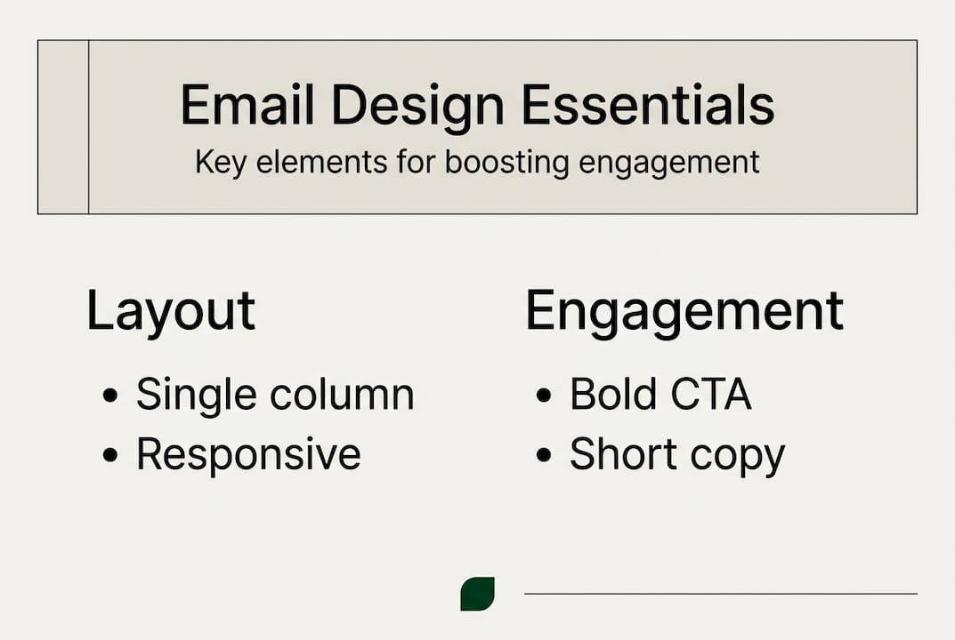
Key email design elements every e-commerce marketer should prioritize
Implementing specific design elements creates emails that serve both deliverability and conversion objectives. These tactical choices build on the strategic foundation of trust and functionality. Each element plays a distinct role in guiding subscribers toward engagement and action.
-
Single-column layouts for universal compatibility: This structure ensures consistent rendering across all email clients and devices. Mobile users, who represent the majority of email opens, benefit from content that flows naturally without horizontal scrolling or pinch-to-zoom frustrations. Single-column conversational designs also signal authenticity to filtering algorithms.
-
Readable typography with web-safe fonts: Choose fonts like Arial, Georgia, or Verdana that display reliably everywhere. Set body text at 14-16px minimum for comfortable reading on mobile screens. Heading sizes should create clear visual hierarchy without overwhelming the layout. Consistent typography builds professional credibility while maintaining accessibility.
-
Strategic color palette for brand consistency: Limit your color scheme to three or four complementary colors that reinforce brand identity. Use your primary brand color sparingly for CTAs to make them pop. Avoid overwhelming readers with rainbow effects that distract from your message and reduce the professional appearance that builds trust.
-
Optimized imagery that reinforces messaging: Every image should have a clear purpose, whether showcasing products, demonstrating benefits, or creating emotional connection. Compress images to load quickly without sacrificing quality. Balance visuals with text to maintain deliverability while creating engaging content. Images alone never tell the complete story.
-
Personalization in subject lines and content blocks: Dynamic content that addresses subscribers by name or references their purchase history increases relevance and engagement. Email personalization techniques extend beyond basic name insertion to include behavioral triggers, location-based offers, and segment-specific messaging that resonates with individual subscriber needs.
-
Accessible alt text for all images: Descriptive alt text serves multiple purposes, improving deliverability by adding valuable text content while ensuring subscribers with images disabled or using screen readers can understand your message. This practice demonstrates inclusive design while supporting technical performance.
Pro Tip: Create a design system document that defines your email typography, colors, spacing, and layout standards. Consistency across campaigns builds brand recognition and streamlines production.
These email marketing design practices work together to create cohesive campaigns. No single element guarantees success, but the combination builds emails that perform reliably across metrics. Focus on implementing these fundamentals before experimenting with advanced techniques.
Testing and iterating your email designs for continuous improvement
Data-driven testing separates assumptions from reality in email design optimization. What works for one brand or audience may fail for another, making systematic experimentation essential. A/B testing reveals which design choices actually drive results for your specific subscribers rather than relying on industry best practices that may not apply to your situation.
Identify high-impact variables to test first. CTA button placement, color, and copy significantly influence click-through rates. Subject line length, personalization, and urgency affect open rates. Layout complexity, image usage, and content length impact engagement duration. Start with elements that directly connect to your key performance indicators rather than testing minor details that won’t move the needle.
Structure controlled experiments with statistically significant sample sizes. Split your audience randomly to ensure valid comparisons. Test one variable at a time to isolate what drives performance changes. Run tests long enough to account for day-of-week and time-of-day variations in subscriber behavior. Premature conclusions based on insufficient data lead to poor optimization decisions.
| Test Variable | Metric to Track | Minimum Sample Size | Recommended Duration |
|---|---|---|---|
| CTA placement | Click-through rate | 1,000 per variant | 3-5 days |
| Subject line | Open rate | 2,000 per variant | 5-7 days |
| Layout complexity | Conversion rate | 1,500 per variant | 7-10 days |
| Image vs. text ratio | Deliverability score | 2,500 per variant | 10-14 days |
Analyze results through the lens of business outcomes, not vanity metrics. A design that increases opens but decreases conversions ultimately hurts revenue. Look at the complete funnel from delivery to purchase when evaluating test winners. Revenue optimization through testing requires connecting design changes to actual dollars generated.
Document findings in a centralized knowledge base accessible to your entire team. Record what you tested, why, the results, and the implications for future campaigns. This institutional knowledge prevents repeating failed experiments and builds a foundation of proven tactics. Over time, your testing program creates competitive advantages based on deep audience understanding.
Pro Tip: Don’t just test what you think will win. Include a wild card variant that challenges your assumptions. Sometimes the unexpected approach reveals breakthrough insights.
Essential testing practices:
- Establish baseline metrics before making design changes
- Use your email platform’s built-in testing tools for accuracy
- Consider secondary metrics that provide context for primary results
- Retest winning variants periodically as audience preferences evolve
- Share insights across campaigns to accelerate learning
Continuous improvement through email marketing optimization becomes a sustainable competitive advantage. Brands that commit to systematic testing outperform those relying on best practices or creative intuition alone. Your audience tells you what works through their behavior, making testing the most reliable path to effective email marketing strategies that drive retention and revenue growth.
Enhance your email marketing results with expert support
Implementing these email design best practices requires strategic expertise and ongoing optimization. The Email Marketers specializes in retention marketing for e-commerce DTC brands, delivering campaigns that maximize customer lifetime value through proven design and messaging strategies. Our team goes beyond pretty emails to build automated flows, segmentation strategies, and high-converting campaigns that transform one-time buyers into loyal brand advocates.
Our Retention Lab provides comprehensive campaign development and optimization services tailored to your brand’s unique audience. We combine data insights with creative strategy to ensure every design element serves your revenue goals. The Retention Toolkit offers frameworks and resources that help you implement best practices efficiently. Review our case studies to see how strategic email design drives measurable results for brands like yours, increasing repeat purchases and building lasting customer relationships through expertly crafted retention campaigns.
FAQ
What are the most important email design best practices for e-commerce?
Prioritize deliverability through single-column layouts that build visual trust with inbox algorithms. Focus on skimmability with clear hierarchies, concise text, and prominent CTAs that guide readers toward action. Ensure mobile optimization since most subscribers read emails on phones. Personalize content to increase relevance and engagement. Test design elements continuously to optimize based on your audience’s actual behavior rather than assumptions.
How does email design impact deliverability?
Inbox algorithms analyze visual patterns to classify emails as personal, promotional, or spam. Conversational single-column designs mimic personal emails, signaling trustworthiness that earns primary inbox placement. Complex layouts, excessive images, or unusual formatting trigger promotional filtering. Design choices directly influence whether subscribers see your message at all, making deliverability optimization the foundation of effective email marketing.
What should I test first to improve email design performance?
Start by testing CTA button placement and copy since these directly impact click-through rates and conversions. Experiment with centered versus left-aligned CTAs to find what resonates with your audience. Test email layout complexity, comparing simple single-column designs against more elaborate structures. Evaluate subject line variations to optimize open rates. Use data from these high-impact tests to drive iterative improvements rather than relying on creative intuition. Learn more about effective CTAs to maximize testing impact.
How can I balance brand aesthetics with functional email design?
Incorporate brand colors, fonts, and imagery within a simple, functional framework. Use your primary brand color strategically for CTAs to make them stand out while maintaining visual consistency. Apply brand typography in readable sizes that work across devices. Include signature visual elements like logos or patterns without overwhelming the layout. The key is ensuring every aesthetic choice supports rather than hinders the email’s conversion goal, creating designs that feel authentically on-brand while driving measurable results.
Why do simple email designs often outperform complex ones?
Simple designs reduce cognitive load, allowing subscribers to quickly understand your message and identify the desired action. Complex layouts create decision paralysis and visual confusion that increases bounce rates. Simple emails load faster, display consistently across email clients, and maintain better deliverability scores. Subscribers spend seconds scanning emails, making clarity more valuable than creativity. Focus on communicating one clear message with an obvious next step rather than showcasing design skills that distract from conversion objectives.


